Boost Your Mobile App Design with Intuitive Interfaces in 2026
Last updated: Jun 22, 2026
Designing a successful mobile app today demands more than aesthetic appeal; the focus must be squarely on user-friendly app interfaces that deliver seamless, intuitive, and efficient experiences.
Mobile users expect apps that are adaptive to their individual needs, in addition to being accessible to all, along with being easy to navigate.
To achieve this, one must understand current design principles coupled with best practices for improvement of usability, engagement, and retention.
The Importance of User-Friendly App Interfaces
Users find intuitive interfaces less frustrating.
These interfaces also make adopting apps easier.
If apps are clear, responsive, and accessible, users achieve their goals faster and enjoy the process more.
This not only satisfies the users but it also retains as well as keeps the apps.
Such interfaces need a solid foundation, and creation starts by applying user-centric approaches.
Also key is prioritizing the user experience (UX) and user interface (UI) in harmony.
Designs that are emotionally engaging as well as easy to use and functional should be created through elements working together.
Best Practices for Designing Modern Mobile Apps
Prioritize Minimalism and Clarity
Basic design reduces cognitive load and highlights important features of the app.
Users are able to focus on key tasks due to a clean layout.
Ample whitespace does help to prevent some distraction.
This method creates better readability.
Also, it is easier to navigate now.
A calm and professional feel is also helped along through the usage of a restrained color palette with branding elements.
Subtly, micro-animations offer feedback upon user actions to help users understand interactions intuitively.
Adopt a Mobile-First and Responsive Mindset
The interface works optimally upon smaller screens with touch input when designing mainly for mobile devices.
Responsive layouts do adjust fluidly across many different screen sizes as well as orientations, and consistently allow for the user to experience the same thing on a phone or tablet.
Key considerations include that designers design sufficiently large touch targets (at least 44x44 pixels) so fingers tap easily, that they optimize navigation so thumbs reach it, also that they create natural vertical scrolling flows.
This mobile-first approach avoids the common pitfall in which desktop designs shrink, and it instead provides an experience that developers built for the device.
Implement Personalization with Care
Leveraging data-driven personalization helps apps to feel much more relevant to individual users as it improves engagement.
Apps meet various demands, adapting content layout and features for simplicity based on user behaviors and choices.
For example, dynamic dashboards or predictive searches let users access relevant information quickly through smart suggestions.
However, balancing automation for user control is important.
This equilibrium prevents overburdening users, therefore it keeps faith.
Focus on Accessibility for Inclusivity
In the event that an app is user-friendly, everyone should find that app usable for people, including those with visual, motor, or cognitive impairments.
For designers, it is best to incorporate practices such as sufficient contrast ratios in addition to scalable text sizes.
They should incorporate voice navigation support as well as screen reader compatibility.
Accessibility features let you widen your user base and comply with legal standards while showing social responsibility.
Dark mode design is another important element, so it reduces eye strain as well as caters to users in low-light environments to conserve device battery life.
Ensure Consistency Throughout the Experience
Consistency in design elements across screens and interactions makes users confident during the building of an app that users can predict and learn.
Consistent terminology, iconography, typography, and placement of interface components are what we use.
This reduces confusion also increases efficiency.
When users move in the app, they need a similar navigation.
Along with visual elements, gestures, button behavior, and feedback are interaction patterns to which this principle also applies.
Test and Iterate Based on Feedback
Areas that cause pain plus areas that need improvement are exposed through usability testing done with real users.
Iterative feedback cycles allow designers to evolve with the design.
The design will then align with user needs and expectations.
Performance monitoring, A/B testing, as well as funnel analysis may inform decisions, so this ensures that changes improve the user experience instead of disrupting it.
High standards in a user-friendly app’s interfaces depend upon the frequent validation of them.
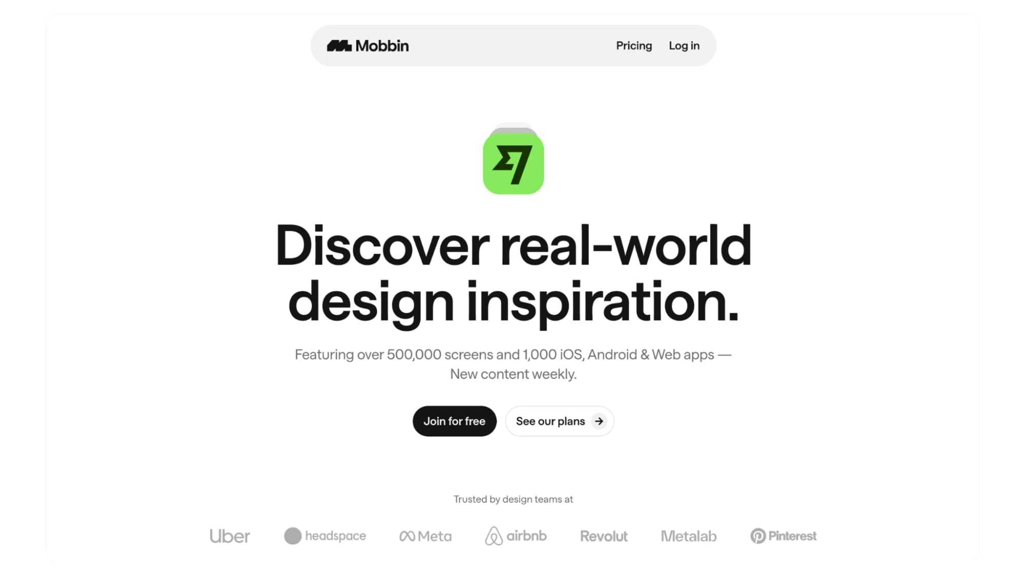
Leveraging Design Inspiration and Resources
Exploring design patterns coupled with practices offers inspiration from apps that succeed.
Designers can find many ideas for creating interfaces suiting modern users using tools such as Mobbin that curate user interface trends and examples from mobile applications.
Designers are able to benchmark work that is against standards and adopt more solutions while avoiding some pitfalls using authoritative resources.
Conclusion
For 2025, designers must make a commitment to the creation of interfaces for user-friendly mobile apps.
Clear interfaces that are accessible, responsive, along personalized shape the path to outstanding app design.
Using guidelines such as minimalism, mobile-first design, accessibility, consistency, and continuous testing, app creators can provide retention and satisfaction that foster outstanding user experiences.
These optimal methods yield apps with great looks that also operate perfectly.
As a result of that, apps do succeed within an increasingly competitive digital landscape with diverse users.
Tech, Product, Money, Books, Life. Discover stuff, be inspired, and get ahead. Box Piper is on Twitter and Discord. Let's Connect!!
To read more such interesting topics, let's go Home
More Products from the maker of Box Piper:
Follow GitPiper Instagram account. GitPiper is the worlds biggest repository of programming and technology resources. There is nothing you can't find on GitPiper.
Follow SharkTankSeason.com. Dive into the riveting world of Shark Tank Seasons. Explore episodes, pitches, products, investment details, companies, seasons and stories of entrepreneurs seeking investment deals from sharks. Get inspired today!.
More Blogs from the house of Box Piper:
- Icons8 Ouch: What I Learned Using It Every Day 2026
- Ensuring Robust Security Measures for Financial Services and Web3 Environments 2026
- Why Online Slots Remain One of the Most Accessible Digital Games 2026
- Why pressure reveals more about skill than preparation alone 2026
- How to Buy a Profitable App - Complete Guide 2026
- Crawlbase - The Easiest Way to Scrape the Web Like a Pro 2026
- Training A New Employee - Email Etiquette And Security 2026
- When and Why You Should Delete Tweets - Protecting Your Digital Footprint 2026
- How to Recover Lost Files after Updating Windows 11? 2026
- Digital Rewards - How Tech Keeps Us Hooked 2026
- How an Answering Service Can Help Small Businesses Compete With Larger Firms 2026
- The Latest NFL TV And Movie Projects 2026
- 10 Sectors Where Crypto Is a Preferred Payment Method 2026
- How Developer Communities Shape the Future of Online Content Platforms 2026
- Where and How to Safely Purchase a Windows Server 2022 Key 2026
- Secrets to Successful Instagram Growth - Buying Followers on Goread 2026
- Leveraging Technology for Financial Success and Productivity 2026
- Developers Guide to Amazon Kinesis 2026
- Developers Guide to Amazon Simple Queue Service (Amazon SQS) 2026
- Creating Your Own CDN Using AWS 2026
- AWS Messaging and Streaming Services Comparison between SQS, SNS, Kinesis, and EventBridge 2026
- Complete List of AWS Regions, Wavelength Zones, and Local Zones Globally 2026
- OSINT - Unlocking The Power Of Intelligence 2026
- Top 50 OSINT Tools That You Should Know 2026
- Top Google Dorks List Categories For Different Uses 2026
- A Look Into the Landscape of Cross Platform Mobile App Development 2026
- AI Chatbots - Major Types, Benefits and Best Practices for Success 2026
- Facilitating Real-Time Collaboration- Harnessing Pusher Technology in Web and Mobile Applications 2026
- Outdated Stereotypes and the Diversification of the Gamer Identity 2026
- Exploring the Role of VPN in Software Development and Cybersecurity 2026
- How to Foster Seamless Collaboration for Optimal Development Team Productivity 2026
- Has AI Broadened Cyber Attack Surfaces More than It Can Help Reduce It? 2026
- Top 10 Must-Have Gadgets 2026
- Safeguarding Your Data: How to Prevent Google Dorks 2026
- What Keeps Online Gaming So Popular? 2026
- How a Developer Data Platform Can Help You Scale 2026
- Building a Neobank- The Path to Modern Banking Innovation 2026
- Outsourced Quality Assurance: A Complete Description of an Effective Action Scheme 2026
- How to Protect Yourself From Google Dork 2026
- What are the benefits of using Kubernetes 2026
- Kubernetes Tutorial - Key Concepts For Beginners With Code Snippets 2026
- Monolith to Microservices — Book Notes, Summary and Top Ideas 2026
- Docker Cheat Sheet: All the Most Essential Docker Commands That Every Developer Should Know 2026
- Reading for Success - How Books Shape the College Experience 2026
- Top 35 Google Dorks List 2026
- How Different Fonts Make People Perceive Different Things 2026
- Web Scraping in JavaScript | How To Scrape A Website Using Scraper API 2026
- Screen Recording for Developers — Detailed Guide 2026
- Bright Data - The World's #1 Web Data Platform 2026
- List of top articles which every product manager should follow 2026
- Top 86 Best Tools For Developer 2026
- Top free tools for startup founders 2026
- Top 7 Best VS Code Extensions For Developers 2026
- 80+ Best Tools and Resources for Entrepreneurs and Startups 2026
- The Top 100 Best Destinations For Remote Workers Around The World 2026
- 5 Best tools to Convert Images to Text 2026
- 5 Simple Tips for Achieving Financial Independence 2026
- Buying a Computer for Remote Work - 5 Things to Know 2026
- How to Perform Advanced Searches With Google Dorking 2026
- 10 Remote Jobs You Can Start Today (Without a Degree) 2026
- You can be the very best version of yourself by recognizing 50 cognitive biases of the modern world 2026
- Branding Tactics to Get More YouTube Views 2026
- How to write a software review 2026
- How to replace an old PC with a new one 2026
- The new favourite in the VPN world 2026
- 11 Best NodeJS Frameworks for Web Apps 2026
- How to Estimate Custom Software Development Costs for Your Projects 2026
- Key Technologies Every Business Should Implement to Improve Privacy 2026
- Commonly known plagiarism checking techniques 2026
- Trends in Domain Names 2026
- 15 Major Vue UI Component Libraries and Frameworks to Use 2026
- Jooble Job Aggregator – Your Personal Assistant in Job Search 2026
- How to Scrape any Website and Extract MetaTags Using JavaScript 2026
- Herman Martinus: Breathe Life Into Your Art And Create Minimal, Optimized Blog 2026
- BlockSurvey: Private, Secure- Forms and Surveys on the Blockchain 2026
- Magic Sales Bot: A GPT-3 powered cold email generator for your B2B sales in 2021 2026
- Scraper API - Proxy API for Web Scraping 2026
- Divjoy - The Perfect React codebase generator for your next project 2026
- Presentify: A Mac App to Annotate & Highlight Cursor On Your Screen 2026
- Mister Invoicer: Invoice as a Service for your business 2026
- The Top 15 Most Commonly Used AWS Services You Should Know About 2026
- JavaScript Algorithms: Sort a list using Bubble Sort 2026
- Google Dorks List and Updated Database 2026
- Google Dorks List and Updated Database for Sensitive Directories 2026
- Google Dorks List and Updated Database for Web Server Detection 2026
- Google Dorks List and Updated Database for Online Devices 2026
- Google Dorks List and Updated Database for Files Containing Important Information 2026
- Google Dorks List and Updated Database for Error Messages 2026
- Google Dorks List and Updated Database for Advisories and Vulnerabilities 2026
- Google Dorks List and Updated Database for Files Containing Usernames and Passwords 2026
- Google Dorks List and Updated Database for Files Containing Passwords 2026
- Google Dorks List and Updated Database for Files Containing Usernames 2026
- Google Dorks List and Updated Database for SQL Injection 2026
- JavaScript Array forEach() Method - How to Iterate an Array with Best Practices 2026
- SOLID - The First 5 Principles of Object Oriented Software Design Principles 2026
- Circuit Breaker Pattern - How to build a better Microservice Architecture with Examples 2026
- Topmost Highly Paid Programming Languages to Learn 2026
- What is Docker and why it is so popular 2026
- GitHub CLI - GitHub and command line 2026
- The Pomodoro Technique - Why It Works & How To Do It - Productivity Worksheet and Timer with Music 2026
- Seo Meta Tags - Quick guide and tags that Google Understands and Impacts SEO 2026
- npm ci vs npm install - Run faster and more reliable builds 2026
- Investing In Horses- Is It A Wise Financial Investment? 2026
- The role of cybersecurity in protecting online casinos 2026
- The Pratfall Effect - Psychological Phenomena, Changing Minds, and the Effects on increasing interpersonal attractiveness 2026
- The Role of Encryption in Securing Call Recordings 2026
- Secure and Without Delay- How ACH Payments Bolster Online Casino Safety 2026
- The Social Impact of Smartphones- Bridging Gaps and Fostering Connections 2026
- Why are Credit Cards still Popular for Online Transactions?
- How Poker Players Use Tech Tools to Analyze, Improve, and Win 2026
- Are KYC Practices Redundant In 2025?